This whitepaper is decidedly focused on themes that have more quantitative aspects. However a general understanding of these would be important for senior and department management to be forewarned by what they might hear or be pitched relative to new biomarkers.
First will be a discussion of the overall discovery and development process. Then there will be discussions of two aspects of the misunderstood ROC curve.
Biomarker Discovery and Development
Every day there are announcements of new biomarker discoveries. Yet, very few biomarkers are validated, and even fewer are ever used clinically. Having a relevant process, and understanding some of the issues upfront to avoid pit falls should improve this. It is important to understand the nature of luck and randomness when discovering novel biomarkers.

What lessons are there to help improve this situation?
The next figure illustrates a high-level approach. It follows best practices, which include using upfront hypothesis testing and validation, as well as avoiding red flags and opportunities for bias in designing experiments.
At the end of the essay is quantitative information from a simulation using real-world data.
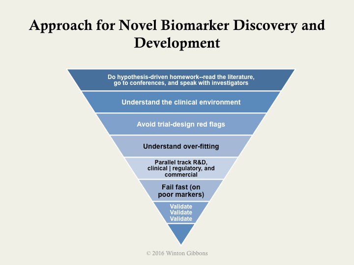
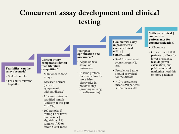
More specifically, the following example shows some practical, specific milestones. These included suggested types and number of samples, as well as a bit about prevalence in upfront discovery. Validation should almost always be done using all-comers who exhibit signs and symptoms of the disease, rather easy comparisons such as near normal patients.
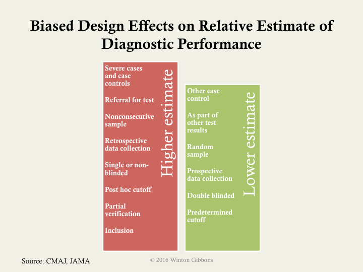
As noted in the overall process, trial design issues should be avoided. The major biases should be assessed: selection of proper samples or patients, verification of only those screened in for testing, inclusion of the training set of samples with the test set of samples or patients in the final analysis, and poor blinding. Often the last point is hard implement in a research environment, as scientists view this an affront to their objectivity. However, there is an abundance of data showing that this is necessary, no matter how well intentioned.

If the big 4 biases are not controlled, then a higher estimated performance than appropriate will likely be calculated. The next figure illustrates how various biases or experimental designs can increase or decrease the estimate performance of a test.
If one cannot get sufficient numbers of patients there are ways to mitigate potential false discoveries. The most used approaches are:
Bonferroni correction (most conservative)
- Divide the desired p value (probability of true discovery) by the number of biomarkers or algorithms tested.
- This establishes the new p value that any biomarker or algorithm must pass.
False discovery rate
- Similar to Bonferroni for assessment of the biomarker | algorithm with the best p value.
- For subsequent, the desired p value is divided by the number of biomarkers | algorithms remaining to be assessed (i.e., the correction gets easier if some biomarkers | algorithms pass)
Simulation
To give some specificity to potential ways to improve, a simulation was conducted – using actual biomarker data – in order to help frame quantitatively sample sizes, numbers of markers, and often less considered, disease prevalence.
The key lessons on proportions were
- Don’t use less than 250 patients, even when assessing only a few markers
- Start to beware retrospective individual marker discovery at 50 potential markers, in the context above
- For multi-marker indices, beware starting at 25 potential markers
- When prevalence is below 12%, then use more than 1,000 patients
- Using 500 to 1,000 patients with a prevalence greater than 12%, is relatively good, even up to assessing 100 markers
In the simulations run the number of patients varied from 50 to 1,000 patients, the number of markers varied from 1 to 100, and the prevalence varied from 6% to 50%.
The further noteworthy findings included
- Degrees of freedom can dramatically affect retrospective biomarker analysis.
- As either the prevalence, or number of patients decrease, the higher the risk for perceived but random positive results in marker mining.
- False AUCs (area under the curves or c-statistics) can be quite high.
- The average experimental AUC for random single markers was 0.62, with the highest a whopping 0.97.
- The average experimental AUC for random multi-marker indices was 0.65, with the highest a perfect 1.00.
Biomarkers have great value, but only when valid. Having an approach, understanding the patient numbers required, and avoiding biases should increase the chance of success.
Below is a presentation of the material presented above.
A Myth about ROC Curves and C-statistics
Area under the curve (AUC or c-statistic) is not paramount.
Shape often matters more.
What is the issue?
It boils down to the clinical use of a particular diagnostic. This is not represented by the area under the curve (AUC), or c-statistic. It is determine by the shape of the curve.
There are other nuances as well.
To begin with, the AUC is only a rough guide of what’s good, and for the most part predominantly useful in comparing curves of the same contour. The bigger the area, for one of a group of curves with the same profile, the better. However, curve shape matters.
A lot.
As can be seen in the figure below, a steep shape at the bottom near the y-axis (high-specificity or low false positive fraction) is best for rule in. The patient has the disease. Likewise, a shallow, asymptotic shape at the top, with very high sensitivity, is best for rule out as not having the disease. So, curves that are big at the top, or bottom, are generally more clinically useful than those that are big in the middle. Many (most?) curves are big in the middle.* In contrast, the skewed shapes have a more straightforward clinical value. This can be so, even if the AUC is lower for the skewed curve than a more well rounded shape.

What are the implications?
For one thing, the idea that the optimal cut-off for an ROC curve is at the 45 slope inflection is incongruous. The cut-off should be set clinically, based on the treatment algorithm, the risks of false negatives, and the costs and risks of false positives. In fact, for a curve such as the one below (real, disguised data), two cut offs would be appropriate, and the diagnosis of patients between them indeterminate.

What does this mean practically?
Lately, ROC analysis is being used a lot for biomarker discovery, multi-marker indexes (FDA termed IVD MIAs), and the like. Differences in areas under the curves (help) drive selection of the markers. Often, lists of biomarkers or algorithms are merely ranked by AUCs (c-statistics) as a screen—high good, low bad. Of course, if too many biomarkers are being assayed against too few patient samples, this traditional use of ROCs, breaks down even more (so called false discovery, a topic for another day).
It goes without saying, that before this kind of analysis comparing biomarker performance, one should understand the clinical issues and fit for the diagnostic. With this understanding, trade offs between false positives and negatives, sensitivity versus specificity, or importance of positive or negative predictive value can be reasoned. That shows where on the curve one should be, and what contour can work best. The clinically valuable biomarker, and its ROC, may appear quite middling in the normally used stats, but be the most useful.
So it’s time to slog it out. Look at and compare the shapes. For those that appear useful and similar in profile, the AUC is the right tool, and a great tool, for selecting the best biomarker(s). Use it then.
ROC Area Under the Curve (AUC) Subtlety that is Often Forgot
For those who know ROCs well, this discussion might likely be obvious and well known. However, for many practical users of ROCs, this could be surprising.In addition to AUCs and sensitivities and specificities, positive and negative predictive values (PPVs and NPVs) are mentioned more and more, as they should be, given their clinical importance. Some (often?) times when PPV and NPV are discussed, the formula assumes that the prevalence is equal between the diseased and the normal populations.
This does not take into account disease prevalence, which most often has dramatic results.**
Example:

From this example, one can see the classic issue with screening assays. Even with decent sensitivity and specificity, the PPV is untenable. For most disease requiring screening, the prevalence is even lower, <0.1%, and he situation worse (95% sensitivity and specificity lead to only a 2% PPV).
Additionally, at low disease prevalence the NPV is 99+% even for very, very poor assays. (“You very probably don’t have the disease.”)
As can be seen, at higher disease prevalence, it is hard to rule out disease (NPV).Disease prevalence is critical (and can be manipulated by inclusion and exclusion criteria of a study).
The implication of all this is that the rules of thumb regarding AUCs don’t have value except in light of disease prevalence – very often not mentioned in study results. Even though, more and more NPV and PPV are mentioned, and calculated using disease prevalence, authors and readers gravitate towards the comfortable AUC metric. This is doubly compounded by the choice of cut-offs (and as we know from the shape discussion, perhaps two cut-offs should most often be chosen – one best for PPV and on for NPV).
Companies harp on AUCs, often mediocre even themselves.
So, we’re back to that simple and misleading metric again. Shape is often more important. When considering ROCs, it is crucial to understand the curve’s shape, the epidemiology (e.g., prevalence), and of course the intended clinical use of the test.
* There are exceptions, for outstanding assays, like troponin for heart attack, or CCP for rheumatoid arthritis.
** This leads to PPV equaling true positives divided by (true positives plus false positives). For NPV, the value would be true negatives divided by (true negatives plus false negatives).
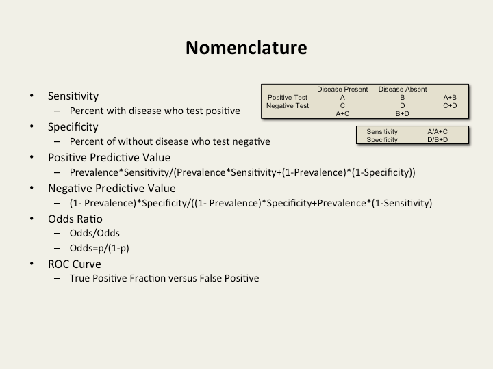
Preferred nomenclature and calculations